Founded in Edinburgh over a century ago, Baillie Gifford’s core mission remains unchanged. In a constantly evolving world, they actively seek out companies with the potential to revolutionise their industries, drive growth, and deliver superior investment returns for their clients over the long-term.
Challenge
Our job was to support Baillie Gifford’s forward-thinking approach and communicate their values with a refreshed visual identity to better position them in the modern investment landscape. This was achieved through a close partnership with their internal creative team, ensuring alignment with their vision and ethos.
Background
The resolve of Baillie Gifford is to focus firmly on the long-term opportunities for companies. They believe actual investors think in decades not quarters. Their unique perspective allows them to imagine what will happen over years, not months.
They seek out opportunities by looking at the world through a different lens. This visual metaphor – built upon their three pillars – provided the inspiration for our new brand identity system. We referred to it as ‘the power of three’.
What we did
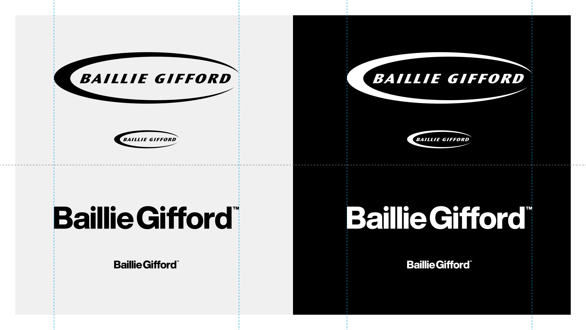
We created a modernised wordmark which provided a much stronger brand presence, improved legibility and suitability for a digital-first visual identity system. Creating a much cleaner and bolder marque provided us with a stronger logo to lock-up with their vast range of products and services.

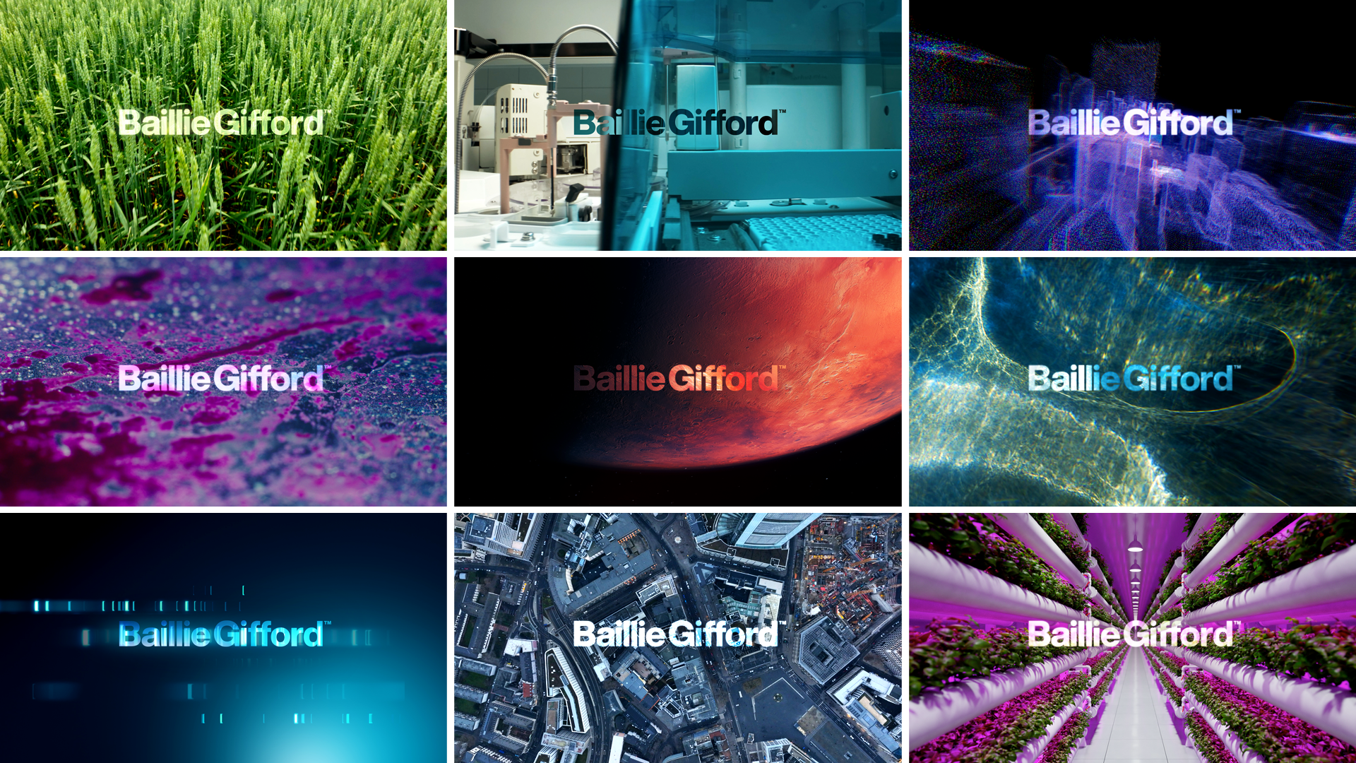
We aimed to make the logo more dynamic, enhancing Baillie Gifford's visibility across the diverse range of sectors in which it operates. To achieve this, we placed the wordmark against a variety of backdrops, ranging from literal depictions of global economic hubs to symbolic representations of the sectors they invest in and the positive change they aim to drive. These diverse visuals became central to the rebrand, reinforcing their commitment to seeking the innovations and individuals that will drive change.

Additionally, we developed a flexible colour theory that allowed the wordmark to adapt to any colour drawn from its backdrop. This approach broke free from the limitations of a single brand colour, introducing versatility and reflecting the full spectrum of perspectives through which Baillie Gifford view the world.
The motion branding was designed to provide a vision of what is possible. Our lens device frames the disruptive businesses of tomorrow as they help to shape the new world. It provides a striking graphic offset effect to build strong brand recognition no matter the image placed within it.
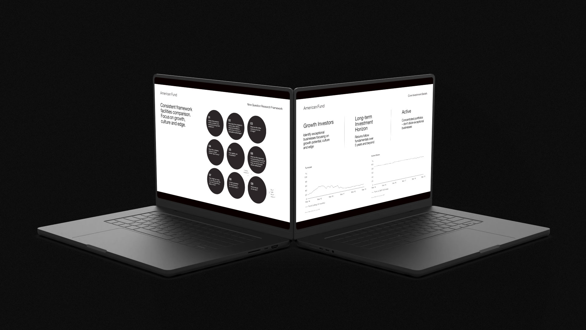
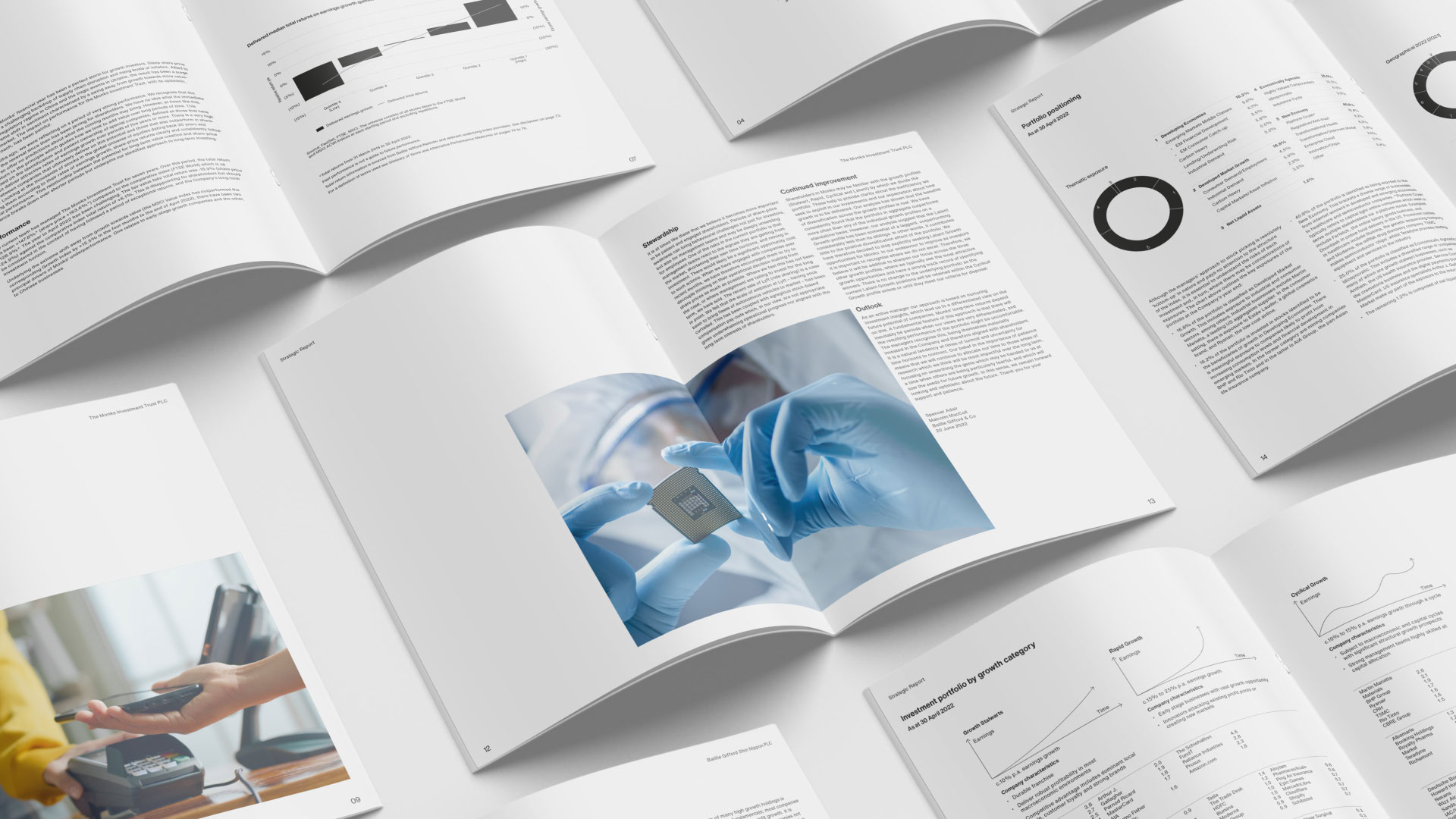
Through close collaboration, we developed a brand toolkit that enabled both digital and physical collateral creation. This partnership allowed for a seamless rollout, ensuring Baillie Gifford’s refreshed identity resonated across every touchpoint.


Testimonial
Tom Barrett Director, Digital & Brand, Baillie Gifford“Dog brought a huge amount of experience, knowledge, and expertise when we partnered with them to develop our brand and visual identity. They worked very closely with our inhouse creative team to deliver a contemporary evolution of our visual and written design language which, we believe, clearly communicates the value of our difference.
A vital part of this work was considering how and where our audiences interact with us both now and into the future as content consumption and distribution methods evolve. Considering this, the work extended across all formats and channels including digital, motion, sonic and physical to ensure we are well placed to deliver quality and consistency in our design. We continue to be excited to bring the brand vision and design work to life.”

